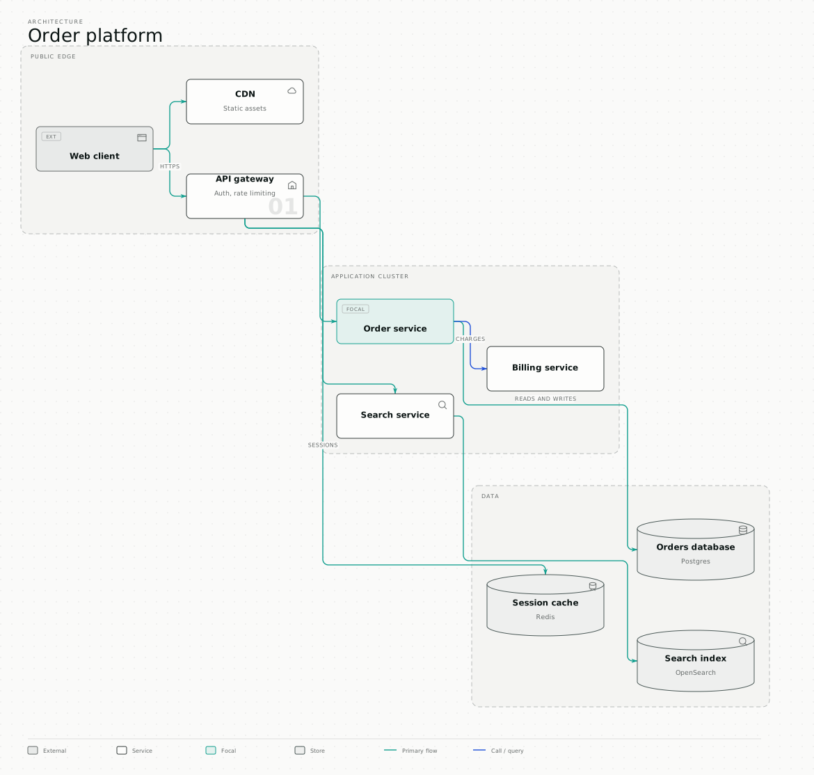
A system architecture diagram has one job: let somebody who has never seen your system work out how a request gets served, in under a minute. Most fail because they try to be the documentation instead.
A quick note on the phrase, because search engines conflate them: this is about software architecture. If you are here for massing diagrams, sun paths or axonometric drawings, this is the wrong kind of architecture.
Pick one level of detail and stay there
The single most common defect is mixing levels — a box labelled "AWS" beside a
box labelled UserRepository.findById. Both may be true. Together they are
unreadable, because the reader cannot tell what scale they are looking at.
Four levels are worth drawing, and each is a separate diagram:
- Context. Your system as one box, surrounded by the people and external systems it talks to. Fits on a slide. Often the only one an executive needs.
- Containers. The deployable things — web app, API, worker, database, queue. This is the level most "architecture diagrams" should be and are not.
- Components. Inside one container. Draw this only for the container somebody is about to change.
- Code. Classes and functions. Almost never worth drawing by hand; generate it if you need it, and expect it to be stale within a sprint.
If you draw only one, draw the container level. It is the level at which "how does a request get served" has an answer.
What actually belongs on it
Group by trust or deployment boundary. The diagram on this page groups by public edge, application cluster, and data. Those boundaries are the load-bearing information — they are where security reviews and outages happen. Grouping by "team that owns it" instead produces a diagram that is obsolete after a reorg.
Mark the datastores. A reader scanning for state should find it by shape, not by reading every label. Which things persist data is the first question anyone asks of an unfamiliar system.
Label the edges that are not obvious. "HTTPS" on the browser-to-gateway line earns its space. An arrow between two internal services usually does not need a label saying "calls".
Emphasise one thing. Every architecture diagram is drawn for a reason — usually a change. Make the thing under discussion visually distinct, and the diagram becomes an argument rather than an inventory.
What to leave out
Load balancers that do nothing but balance load. Every availability zone. Monitoring, unless monitoring is the subject. The company logo.
The test is simple: if removing a box does not change what the reader concludes, the box was decoration. A system architecture diagram is finished when nothing can be removed, not when everything has been added.
Why yours goes stale
Most architecture diagrams are drawn once, in a tool nobody opens again, and exported as a PNG that lives in a slide deck. Six months later the system has moved and the diagram cannot be edited, so a new one gets drawn from scratch.
Two things fix that, and neither is a better drawing tool:
- Keep the source, not the picture. A diagram stored as text — Mermaid, or a structured format — can be diffed, reviewed and edited a year later.
- Make regeneration cheap. If updating the diagram means an hour in a canvas editor, it will not happen.
If you already have one
An existing Visio, draw.io or Lucidchart file does not need redrawing to be presentable. Drop it into the converter: the structure you arranged is kept, the palette and type become yours, datastores and external systems are drawn as what they are, and it exports as SVG, PNG or editable PowerPoint — real shapes and live text, so the next person can fix a label without starting over.