Most flowcharts fail for the same two reasons: every box is the same shape, so the reader cannot see where a decision happens, and the branches are unlabelled, so they cannot tell which way "yes" goes.
Both are fixable in about a minute. Here is the vocabulary, then the examples.
The five symbols that carry almost everything
There are dozens of shapes in the ANSI/ISO set. In practice five do the work:
- Rounded rectangle — start and end. A process has one entry point and, ideally, one exit. If you have four end shapes, you probably have four flowcharts.
- Rectangle — a step. Something happens. If you cannot name it with a verb, it is not a step.
- Diamond — a decision. Two or more branches leave it, and every branch gets a label. An unlabelled diamond is the single most common defect.
- Parallelogram — input or output. Data entering or leaving. Optional; plenty of good flowcharts never use one.
- Cylinder — a datastore. Where something is read from or written to.
Anything beyond these is specialist. Adding shapes does not add rigour; it adds a legend nobody reads.
Example: a refund request
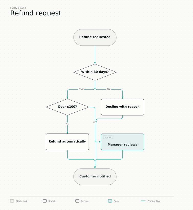
The diagram at the top of this page is the whole vocabulary in one picture. Read it once and notice three things:
- Both diamonds have labelled branches. You never have to guess which line is "no".
- One box is emphasised. A reader who looks for two seconds should come away knowing the manager review is the point of the diagram.
- There is one start and one end. Every path converges on "customer notified", including the rejection path — because the customer is told either way, and the diagram would be lying if that line stopped early.
Four flowcharts worth copying
A decision flow. Refunds, approvals, escalations. Diamonds dominate, and the value is in the branch labels rather than the boxes.
A linear process. Onboarding, publishing, deployment. Almost no diamonds. If yours is genuinely linear, resist adding fake decisions to make it look substantial — a straight line is a legitimate answer.
A troubleshooting tree. Starts with a symptom, ends with a cause. Reads top-down and never loops. If it loops, you have a state diagram, and drawing it as a flowchart will hide the cycle.
A handoff process. Any flow crossing two or more teams. This is the one case where a plain flowchart is the wrong tool — use a swimlane diagram instead, because the question being asked is who, not what.
The two mistakes
Unlabelled branches. Label every line leaving a diamond, always. If a diamond has one unlabelled exit, it was never a decision.
One shape for everything. A flowchart where every node is a rectangle transmits sequence and nothing else. Shape is the only channel carrying kind, and it is free.
Turning one you already have into something presentable
If the flowchart exists in Visio, draw.io, Lucidchart or Mermaid, you do not need to redraw it to fix how it looks. Drop the file into the converter and it comes back on your own colours and type, with shapes mapped to their meaning — decisions as diamonds, datastores as cylinders — and exports as SVG, PNG or editable PowerPoint.
The arrangement you chose is kept. Only the drawing changes.